Podcast (marketing-podcast): Play in new window | Download | Embed
Do you want your marketing to be on-trend? What are the top design trends of 2020? Which trends can be used best in different areas of your business?
In this podcast episode, Sam Carvalho talks about 11 current design trends of 2020 that you need to know about.
In This Podcast
Summary
- DOs and DON’Ts of when to use design trends
- 11 Design Trends of 2020
DOs and DON’Ts of when to use design trends
- DO use design trends for time-specific marketing material, i.e. print material for a specific event, or social media marketing.
DON’T base the fundamentals of your brand on design trends, i.e. your logo or your website, things that you want to be timeless.
11 Design Trends of 2020
Design trends of 2020 have moved to a more reserved, harmonious, natural feel, with the inclusion of abstract illustrations.
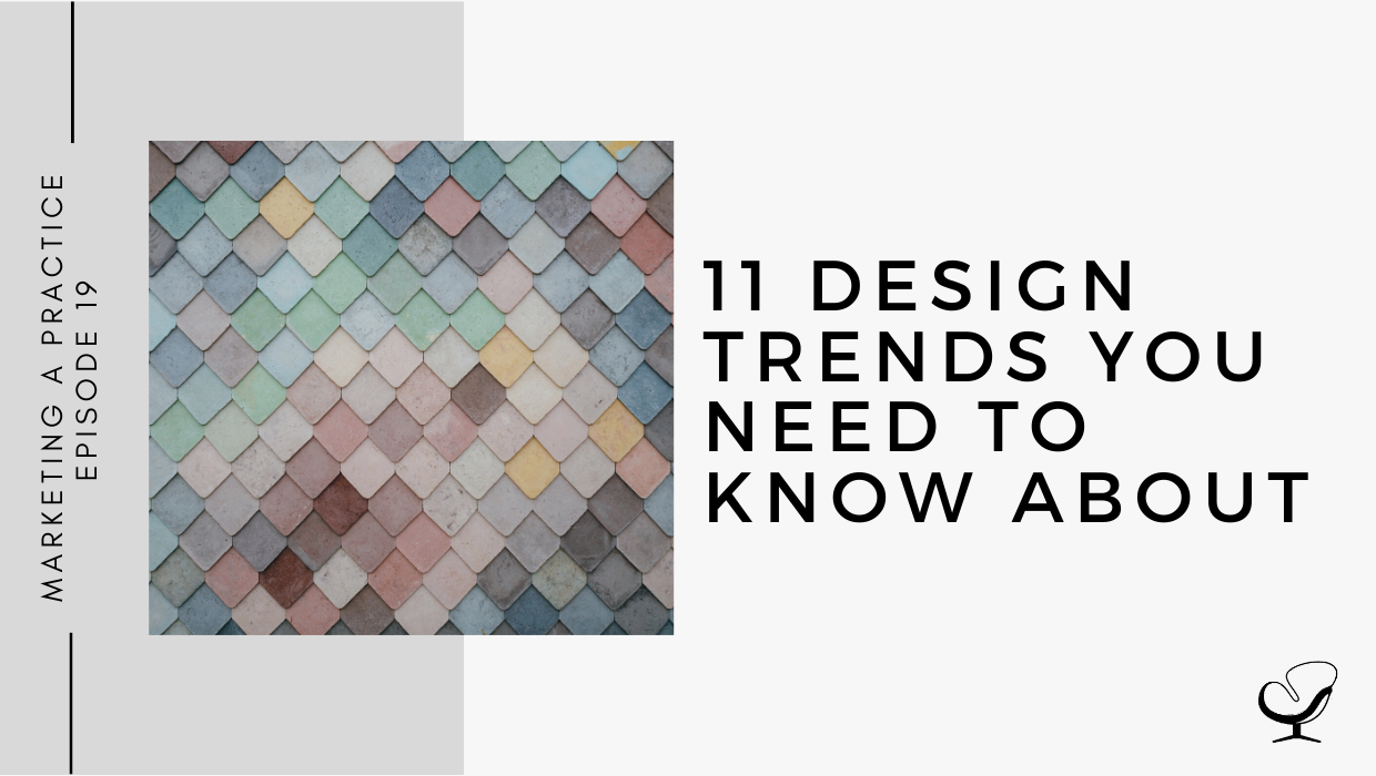
1. Muted color palettes
Stepping away from vivid, bold colors towards more muted color palettes, I.e.: colors which have been slightly desaturated with black, white, or a complementary color —> tints/shades
Monochrome color palette – one color but variations of that color which can be very effective. This gives a vintage feel.
Suits private practices and counseling because it gives a calming feel.
2. Color gradients
You would usually see it as a background on a website where it maybe goes from a light shade to a darker shade or even two or more different colors. But it’s not just being used in backgrounds anymore, it’s being used a lot more in design across the board. When used correctly, this can add a lot of depth and texture to an image.
3. Abstract illustrations
Simple illustrations don’t have the same eye-catching power that they once did, they’ve been overused. It’s now more about imaginative, abstract, even dreamy illustrations.
Line art: schematic, simplified illustration style – great for conveying concepts and ideas. Looks clean, elegant, and unobtrusive.
These types of illustrations would work well in private practice for infographics in your waiting area.
4. Fonts
Fonts are ever-changing. In 2020, we’re seeing a lot of the following:
- Bold/extra bold fonts. Using these bold fonts creates contrast and hierarchy in designs, especially when paired with a simple background / lighter font. This is super impactful, really gets your message across, and can be very effective in social posts.
- Artistic typography where the words are incorporated into flowers, geometric shapes, etc.
- The font follows a shape eg. a quote following the line of a circle. This can be really effective in flyers and social media.
- Sections of words overlapping each other with the second copy being transparent or semi-transparent. This one can actually be timeless so it can be effective for certain logos.
5. Flowing shapes and lines
Flowing shapes can be used to convey a natural, approachable, and genuine feeling throughout your designs. They also pair well with other design trends, like muted colors and heavy fonts for a unique composition. Great to use as backgrounds in social posts.
6. Genuine & neutral stock photos
Stay away from common, overused stock photos. Try to use muted landscapes, genuine portraits, and neutral stock photos., which match the current design trends. Great resources can be found here and here.
7. Minimalist landing pages
Minimalism on websites is generally more aesthetically pleasing but it is also really beneficial from a user-friendly perspective. You can achieve better load times and compatibility with mobile devices. Google rewards this with better spots in search rankings.
8. Metallic
For a brand, using gold conveys luxury, class, and good taste. This works with silver and rose gold/copper as well.
9. Image and text masking
This is when you have an image that fills a certain image or text. As this leaves a big portion of the image behind unrevealed, it helps achieve a mysterious and minimalist look. Works well with maxi typography – the big, bold fonts.
10. Doodling on photographs
It helps achieve a more informal, personalized, handcrafted, and overall fun feeling. This is quite fun for social media posts.
11. Geometric designs
These may look simple, but actually require a lot of work in order to recreate a composition that carries the right meaning for people to grasp. Geometric designs are captivating, contemporary, modern, and appeal to a lot of people.
Useful Links:
- 9 Common Logo Design Mistakes | MP 18
- Email Sam at [email protected]
- Design Services With Sam
- Apply to work with us
Meet Sam Carvalho
 Sam Carvalho is a graphic designer living in Cape Town, South Africa, with over five years of experience in both design and marketing, with a special interest and experience in the start-up environment.
She has been working with Practice of the Practice since 2016 and has helped over 70 therapist entrepreneurs take their practices to the next level by enhancing their visual branding. She loves working with a variety of clients on design-intensive tasks and is always up for a challenge!
Follow Sam on Instagram to see some of her work. To work with Sam, head on over to www.practiceofthepractice.com/branding.
Thanks For Listening!
Feel free to leave a comment below or share this podcast on social media by clicking on one of the social media links below! Alternatively, leave a review on iTunes and subscribe!
Podcast Transcription
[SAM]:
Marketing a Practice podcast is part of the Practice of the Practice podcast network, a network of podcasts seeking to help you market and grow your business and yourself. To hear other podcasts like Beta male Revolution, Empowered and Unapologetic, Imperfect Thriving, or Faith in Practice, go to practiceofthepractice.com/network.
Welcome to the Marketing a Practice podcast with me, Sam Carvalho, where you will discover everything you need to know about marketing and branding your business. To find out more about how I can help you brand your business, visit www.practiceofthepractice.com/branding. And if you’d like to see some examples of my design work, be sure to follow me on Instagram @samanthacarvalhodesign.
Hi there. I hope you’re well today and thanks so much for joining the Marketing a Practice podcast. Today I thought we would delve into design trends, specifically current design trends for 2020. So, a few things I wanted to mention before getting started is what we’ve mentioned in previous episodes, which is to shy away from basing the fundamentals of your brand on design trends. And when I say fundamentals, I’m talking about your logo or your website. So those are things that you want to last for a very long time, and you want to be timeless. And the thing with trends is that they come and go, and so you don’t want to look back on your logo in a few years and think that it’s outdated or that it’s turned into a cliché. So that’s something to keep in mind with design trends; they’re more suited to marketing material that is time specific. So, print marketing material for a specific event that you’re running, or social media, is a great space to experiment with design trends. I would still say to try and incorporate it into your marketing. Obviously, design trends are based on the majority and what the majority of people are responding to, so it’s a great way to give the impression that you’re up to date with things and that you’re modern or contemporary and that you understand what modern people respond to. There’s nothing worse than landing on an Instagram page that looks like it was designed 10 years ago. So that’s why I thought I’d do an episode on design trends and help you stay up to date with what the latest looks are, so that it’s something that you can consider including in your marketing material.
So, what we see with design trends for 2020 is a move to a more reserved, harmonious, natural feel and also the inclusion of abstract illustrations which I love and which I’ll get to in a bit. So, the first design trend to take note of is that of muted color palettes. And what we’ve seen is a stepping away from the more vivid, bold colors towards muted color palettes. So, these are colors which have been slightly desaturated with black, white or a complementary color. So, in a previous episode on color theory, we spoke about tints and shades and tints is when you’ve added white to a color, and shades is when you’ve added black to a color. And so, I love this trend, and I think it’s so versatile and so welcoming, and it really can be used across the board. This is something that you can even incorporate into your website. And specifically, it specifically suits private practices and counseling because it gives that calming feel. And another thing we’re seeing within this trend is the use of monochrome color palettes. So, a monochrome color palette is when you’re using one color, but variations of that color and that can also be very effective. And so, all of this gives a more vintage feel, which I love.
The second trend is the increased use of color gradients. So I’m not sure how aware you are of color gradients, but it’s basically, you’d normally see it in the background of something, or on a website, where a color goes from maybe a light shade to a darker shade, or even two different colors or multiple colors. But for example, red going into purple, but it’s not a sudden contrast, the colors bleed into one another. And this is something that when used correctly, can add a lot of depth and texture to an image or an illustration. And it’s something that’s being used a lot more in logos and in design across the board. So, it’s also something to kind of consider and to look into as an option.
The third design trend and this is what I mentioned earlier is abstract illustrations. And what we found is simple illustrations don’t have the same eye-catching power that they once did. It’s obviously from being overused, you’ve kind of seen the same illustration over and over. So now we’re moving to more imaginative, abstract, even dreamy illustrations. And this incorporates another trend, which I really love at the moment, and you’ll see on my Instagram page I’ve gone nuts with it, is line art. And this is a schematic simplified illustration style. So, it literally involves illustrating something pretty much with one line. So, if you can imagine never picking up the pencil, so it just looks like a continuous line, but then it makes up an illustration of something. And it’s really cool and it’s great for conveying concepts and ideas and it looks clean, elegant and unobtrusive. So, this is something to consider if you are wanting to make use of illustrations and an area where this might make sense for you is if… I know a lot of private practice owners put up posters or infographics on their walls for people to read while they’re waiting. And this is an area where you could perhaps use these sort of illustrations to inform the patient on whatever it is that your specialty is. So, thinking of creative ways to incorporate these design trends into your marketing or into your practice life.
The fourth design trend has to do with fonts. So obviously, fonts are ever changing, and the style of font is ever changing and what we’ve seen, what we’re seeing now in 2020 is a move to more bold or extra bold fonts. So, this creates a lot of contrast and hierarchy in designs, especially when paired with a simple background or lighter font. So especially on flyers or brochures, a lot of the time the heading will be in quite a bold, big font and it will take up a lot of space; it will move across multiple lines and almost take up the entire page. And then you’ll have your subheading below that in a much smaller, lighter font. And this is obviously super impactful and really gets your message across quickly. And it can also be effective in social posts. If you have a social post with, you know, four big words on it that kind of speaks to whatever it is you’re wanting to focus on.
Another thing with fonts though is we’re seeing a lot of artistic typography. So, this is when you know the words are incorporated in flowers or when the letters are made out of geometric shapes and things like that. And that’s obviously going more over to the arty side; it isn’t really relevant to you, but it is an area you can play with if you’re interested in that. Another trend with fonts is having the font follow a shape. And this is something that I do regularly on my Instagram page as well where I have a quote follow a circle, for example. And this can also be really effective for flyers, or in your social media. And then finally with fonts is to have sections of words overlapping each other with a second copy being transparent or semitransparent. And another fun trend is to have sections of words overlapping each other, with a second copy being transparent or semitransparent. And this is what I do… what I’ve done, actually, with some logos, having said not to make use of trends in your logos, but this is something that I think can be timeless and it’s having… if your business consists of two names, for example, having the one name in a script font, and the other in a sans serif, bold font, and then kind of having the script font overlap the second word if that makes sense? But that’s something that’s super effective that you can use across the board as well.
So, then the fifth design trend has to do with flowing shapes and lines. And this is obviously more suited to patterns. So, the background of your fly and then you have your words appearing over it. But flowing shapes can be used to convey a natural, approachable, and genuine feeling throughout your designs. They also pair well with other design trends like muted colors, which we already mentioned, and heavy fonts, which we mentioned as well, for a unique composition. So, as I mentioned, it’s great to have as a background, and we’ve also seen just in general a rise in patterns and texture. And these can be a lot of fun to play with as backgrounds for your social posts, and then you have big bold white letters going over those, can be really effective.
The sixth trend is to make use of genuine and neutral stock photos. So this is something that I’ve mentioned in the past as well, especially when it comes to choosing imagery for your website, and that is to stay away from your common, overused, stock photos that appear fake. So, a lot of times people will just grab an image of a happy family, for example, but if you actually look at that image, the smiles are plastered on, it just looks inauthentic. It looks posed. And what’s really nice now is if you go to websites like unsplash.com or pexels.com, they’ve got a great selection of much more authentic stock imagery, and it’s actually free. So, you can download it from there and you can use it without any worry of being sued or anything like that. And what’s nice is that these websites will pick up on the current trends and so you’ll see that a lot of them already include muted landscapes, genuine portraits and neutral stock photos that match the current design trends. So that’s a great place to go to get any imagery you need for any designs, and to ensure that you’re staying abreast of it all.
So, number seven is minimalist landing pages. So, you must have known that minimalism was going to come in at some stage. And minimalism has been around for a while, but now it’s specifically focused on websites. And it has a practical aspect to it too, over and above the aesthetic aspect, which is that it just looks great. I mean, I hate coming onto a website and it’s just overwhelming and there’s hardly any white space. And it’s just too much imagery or too much text. So, minimalism, from an aesthetic perspective, and just from a user-friendly perspective, is really beneficial. But it also achieves better load times and compatibility with mobile devices. So, I don’t know if you’ve experienced this before. But going on a website with a lot of images, for example, it takes a while to load and that obviously is not a great user experience and, especially if you only have a few minutes to be researching something, it’s gonna put you off right away. And also, a lot of people are searching with their mobile devices as well, and to have a website that you can barely navigate on your phone is the worst. So, this minimalist focus on web design really helps with that as well. And Google rewards this. Google rewards better loading time with better spots in search rankings. So, you can actually improve your search ranking if your loading time is as little as possible.
The eighth design trend has to do with metallics. And this is something that a lot of women are drawn to in their designs. And again, it can be really effective. So, this is, if you’ve seen also in some logos, where an element of the logo is in metallic gold. It also works with silver and rose gold or copper. It’s something that’s also used in a lot of wedding invitations, for example. But for a brand, it conveys luxury, class, and good taste. And so, if you’re trying to appeal to that more, let’s say, upper class taste or style, then I would definitely think of incorporating this in some of your marketing material. It looks really stylish. And you can even go so far as to have it printed as metallic. And it’s a specific kind of thing that you need to ask for. Because if you just have it printed in the way that the designer sent it to you, then it’s still going to have that dull look, but you can actually get the printers to do it in a metallic style, which is awesome. So definitely look into that if you’re going for that. The designer will just have to format the image in a specific way, but I will not get into that now.
So, the ninth design trend has to do with image and text masking and without getting too technical, this is basically when you have an image fill a shape. So, let’s say for example, you have a brushstroke across a page; then the image only fills the inside of that brushstroke, and the rest is white, if that makes sense. Or you can use text where the image actually fills the text. So instead of the text being a color, it’s filled with an image. I’m sure you’ve seen this around and this is also very effective and, as it leaves a big portion of the image behind unrevealed, it helps achieve a mysterious and again, minimalistic look. So, it can be very effective for, again flyers, or even on certain pages on your website. And this works best with maxi typography. So again, it’s that big, bold font, to ensure that you get as much of the image in as possible.
So, heading to the last two design trends. The second last one is doodling on photographs. So, this is something that can actually be quite fun for social media. Specifically, if you are sharing some of your personal photographs, you can spend some time doodling on them or more ask your designer to do it for you. Doodling has come back in this sense, and it helps achieve a more informal, personalized, handcrafted, and overall fun feeling. And so, if you just Google it or head onto Pinterest, you’ll see some examples of where people have doodled on photographs – in a professional way, obviously, and it comes out looking really cool.
And the last design trend is that of geometric designs. And this is also something that I am quite nutty about. So, geometric designs: although they look simple, they actually require a lot of work in order to recreate a composition that carries the right meaning for people to grasp. So, it’s something that… I mean, you can basically represent any sort of image or illustration in a geometric format and it adds that extra bit of interest and maybe takes people a little bit of extra time to figure out exactly what it is, or not. But geometric designs are really always, I feel, captivating and contemporary and modern and appeal to a lot of people. So, I would definitely consider including some geometric designs in your marketing material as well.
So just to recap, the 11 design trends that we’re seeing at the moment include music color palettes, color gradients, abstract illustrations, fonts being big bold fonts, flowing shapes and lines, genuine and neutral stock photos, minimalistic landing pages, inclusion of metallic, image and text masking, doodling on photographs, and geometric designs.
So that’s it, guys. I hope this has been beneficial to you. And even if you just have liked some of it that you’ve heard, be sure to chat to your designer about it and see how you can incorporate it in your marketing, and I’ll see you in the next episode.
Thanks for listening to the Marketing a Practice podcast. If you need help with branding your business, whether it be a new logo, rebrand, or you simply want to have a print file designed, head on over to www.practiceofthepractice.com/branding. And if you’d like to see some examples of my design work, be sure to follow me on Instagram @samanthacarvalhodesign.
Finally, please subscribe, rate, and review this podcast on iTunes if you like what you’ve heard. Talk to you soon.
This podcast is designed to provide accurate and authoritative information in regard to the subject matter covered. It is given with the understanding that neither the host, the publisher, or the guests, are rendering legal, accounting, clinical, or any other professional information. If you want a professional, you should find one.