Podcast (marketing-podcast): Play in new window | Download | Embed
How can you convert clients through having a sleek navigational system? What benefits does having an engaging design on your website do for your online memorability? Which three questions must your website answer “above the fold”?
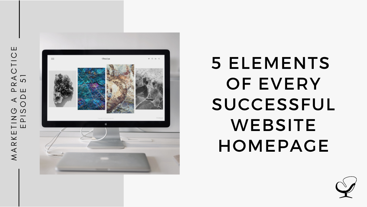
In this podcast episode, Sam Carvalho speaks about the 5 elements of every successful website homepage.
Podcast Sponsor

TherapyNotes! It makes notes, billing, scheduling, and telehealth a whole lot easier. Check it out and you will quickly see why it’s the highest-rated EHR on TrustPilot with over 1000 verified customer reviews and an average customer rating of 4.9/5 stars.
You’ll notice the difference from the first day you sign up for a trial. They offer live phone support 7 days a week.
So when you have questions, you can quickly reach someone who can help, you are never wasting your time looking for answers.
If you are coming from another EHR, they make the transition really easy. TherapyNotes will import your clients’ demographic data free of charge during your trial so you can get going right away.
To get 2 free months of TherapyNotes, no strings attached including their very reliable telehealth platform click on www.therapynotes.com and enter the promo code: Joe
In This Podcast
Summary
- An effective introduction of your business
- A responsive, clean design
- A design that is dynamic, interactive, and engaging
- A simple and sleek navigation
- Appropriate calls to action
1. An effective introduction of your business
The introduction of your business must be effective and enticing enough to answer three key questions about your business that a potential client might have:
- Who are you?
- What do you do?
- How are you better than your competitors?
By providing these answers on your homepage you will be able to help clients understand what your business is about in a single glance and give them the confidence to book an appointment with you without any lingering doubts.
These three answers should preferably all be available to the client “above the fold”, which means before they have to start scrolling to find more information.
2. A responsive, clean design
Potential clients will land on your homepage on a variety of devices:
Therefore, to ensure a better user experience with your website it’s important to factor in a responsive homepage design – this isn’t just for your homepage, this is for your entire website.
A responsive homepage design will make it easier for clients to browse your website without becoming confused, lost or the website getting cluttered with unwisely placed information.
3. A design that is dynamic, interactive, and engaging
As most of you listening are therapists, you know better than anyone that people tend to remember emotionally charged events better than usual ones. Applying this knowledge to your homepage design can help you create a positive experience for your visitors. A dynamic homepage can evoke positive emotions in visitors, increasing the chances of them interacting with your website becoming a memorable one.
However, do not overdo it. Having too many moving parts on your website can cause frustration and might push a potential client to leave your website instead of encouraging them to engage with it further.
Designer tip: A simple and trending way to make your website dynamic is to have a short video in your hero section. This section is at the top of your website above the fold. When attempting this:
- Do not make the video too long.
- Make sure the video size is not too big.
- Ensuring that it maintains its quality across all screen sizes.
Occasionally updating the available information on your homepage will also help to keep your website fresh and current. Make sure that the information you update it with reflects your clients’ needs.
4. A simple and sleek navigation
Browsing a website should be easy, encouraging, and pleasant. Different parts of your website should be easily identifiable and can be cleanly separated with different colors and contrasts.
It is also important to make it easy for a user to know where they currently are on your website and make it easy for them to get to where they want to go. Keep in mind the use of visual representation for visual breadcrumbs to guide your user without bombarding them with too many colors or moving parts.
5. Appropriate calls to action
Make it easy for a potential client to get in touch with you or book an appointment. Provide simple and easily findable calls to action on your homepage so that a client can click and contact you without having to search for it.
CLICK HERE TO DOWNLOAD 5 HOMEPAGE LAYOUT IDEAS
Useful Links:
- Richard Lau: A Logo is a Name and a Feeling, Not an Explanation | MP 50
- Email Sam at [email protected]
- Design Services With Sam
- Apply to work with us
Meet Sam Carvalho
 Sam Carvalho is a graphic designer living in Cape Town, South Africa, with over five years of experience in both design and marketing, with a special interest and experience in the start-up environment.
She has been working with Practice of the Practice since 2016 and has helped over 70 therapist entrepreneurs take their practices to the next level by enhancing their visual branding. She loves working with a variety of clients on design-intensive tasks and is always up for a challenge!
Follow Sam on Instagram to see some of her work. To work with Sam, head on over to www.practiceofthepractice.com/branding.
Thanks For Listening!
Feel free to leave a comment below or share this podcast on social media by clicking on one of the social media links below! Alternatively, leave a review on iTunes and subscribe!
Podcast Transcription
[SAMANTHA CARVALHO]: Is managing your practice stressing you out? Try Therapy Notes. It makes notes, billing, scheduling, and telehealth a whole lot easier. Check it out and you will quickly see why it’s the highest rated e-HR on Trustpilot with over 1000 verified customer reviews and an average customer rating of 4.9 out of five stars. You’ll notice the difference from the first day you sign up for a trial. They offer live phone support seven days a week, so when you have questions, you can quickly reach someone who can help. You’re never wasting your time looking answers. If you have coming from another e-HR, they make the transition really easy. There’ll be nice to input your client’s demographic data free of charge during your trial so you can get going right away. Use the primary code, [JOE], that’s [J O E] to get two free months to try Therapy Notes for free, no strings attached, including their very reliable tele-health platform. Make 2021 the best year yet with Therapy Notes.
Welcome to the Marketing a Practice podcast with me, Samantha Carvalho, where you will discover everything you need to know about marketing and branding your business. To find out more about how I can help you brand your business visit www.practiceofthepractice.com/branding. And if you’d like to see some examples of my design work, be sure to follow me on Instagram @Samantha Carvalho Design.
Thanks so much for joining me today in the Marketing a Practice podcast. I hope that your 2021 is off to a good start. Today, I thought that I would cover five elements of every successful website homepage. So, in previous episodes, we’ve spoken about web design, but today I really wanted to hone in on the homepage particularly. So, we know that in today’s day and age, particularly with the recent effects of COVID-19, it is imperative for your brand to have an online presence in order to reach a wider range of potential clients, which is why putting a lot of thought and effort into a website homepage design can really make the difference between meeting potential customers with a good or bad impression of your company or product. The homepage on a website is the first page a visitor lands on after clicking a search result on Google.
Since this will likely be one of the very first impressions that the visitor has of a company, it’s incredibly worthwhile to make this main page design look as welcoming and engaging as possible. So, think of it as in terms of a brick and mortar store. Your homepage would pretty much be the front of your shop or what people see as soon as they walk into your shop. It’s the very first impression that people are going to get of not only your website, but your brand as a whole. A strong homepage design can entice visitors to spend more time exploring your services, inviting them to learn more, and hopefully convince them to book an appointment. So, we are going to cover up some basic elements that a modern homepage should consist of.
First and foremost, it should have an effective introduction of your business. The most crucial aspect of every homepage is how effectively it catches the visitor’s eye and captures their attention. For this reason, it’s essential for your homepage to answer three key questions about your company in just a few seconds. Those three questions are number one, who are you? Number two, what do you do? And number three, how are you better than your competitors? By ensuring that your homepage quickly and clearly conveys the answers to these three simple questions, you’ll be able to help visitors understand what your business is all about while also giving them the confidence they need to book an appointment. So, not only is it crucial that you answer these three questions on your website, but that you do so above the fold. So, remember that you want users to have answers to these questions as soon as they land on your website and above the fold basically means the section of your website that appears before people need to start scrolling. So, you really want to have answers to those three questions above the fold. You want it to be something that people see immediately as they land on your website.
The second element of a successful website homepage is a responsive clean design. Your website visitors will come through on a variety of devices, from computers to tablets, to smartphones. These days, almost 60% of website traffic is done by a mobile device, therefore, to ensure a better user experience with your website, it’s important to factor in responsive homepage design. And this isn’t just for your homepage. This is for your entire website. Through responsive website design, your navigation will be made easy for users to run through different pages on your website. Functionality will be similar to that of the desktop version and the design will remain clean. So, essentially you want the user journey, the user experience to be the same for your website homepage, as it is on desktop, on mobile as well if not better, because 60% of your traffic is going to come through mobile. Making your website experience consistent regardless of the screen size, what type of device a visitor is using will help keep your branding recognizable.
So, we’ve covered having an effective introduction of your business, answering those three imperative questions above the fold on your homepage, having a responsive, clean design. The third aspect to having a successful homepage design is having a design that is dynamic, interactive, and engaging. So, websites have been around long enough now that it’s not necessary for you to have kind of a boring run of the more static website. There are a few exciting new elements that you can explore to make your website homepage a bit more dynamic. As most of you listening are therapists, you know better than anyone that people tend to remember emotionally charged events, better than neutral ones. Applying this knowledge to your homepage’s design can help you create a positive experience for your visitors. The dynamic homepage can evoke positive emotions in visitors, increasing the chances of their interaction with your website becoming a memorable one.
To this point, however, be careful not to overdo it. So, for those of you who are new to this podcast, if you head back to a few of our previous episodes, you will see I did one on website mistakes. One of the mistakes is essentially overdoing it and not being minimal enough and not having enough white space and kind of having too much going on the page. So, when we speak about having a dynamic website, we obviously don’t want to overdo it. You definitely don’t want to have too much going on. Too many moving parts can also cause frustration and therefore result in someone actually leaving your website instead of engaging further, but a simple currently trending way to have a dynamic homepage is to make your hero section a video. So, for those of you who aren’t too sure, a hero section is essentially the top section of your website just below your navigation.
So, it’s usually where you’ll find a header image with maybe the most important information of your brand. As we mentioned earlier, maybe answering those top three questions and it exists above the fold. So, I’m not sure how many of you have seen lately, but a few websites now, when you land on their page, that whole kind of top section is actually a video. And it is something that immediately grabs your attention and you are immediately engaged. And while you may spend a few seconds watching the video, you’re then kind of drawn to the information that is maybe overlaid over the video or the information alert or the call to action or whatever it may be.
There are a few factors to keep in mind when doing this, however. These are not making the video too long, which may result in it being too big of a file size and therefore taking too long to load. Remember that when people are landing on your website, you don’t want it to take forever for your homepage to load because they are more than likely to bounce and go to somebody else’s website that loads within a few seconds. Time is precious to people browsing on the internet and they don’t want to have their time wasted. So, you want to make sure that your video file size isn’t too big, and that it’s not too long. It really just needs to be, I’d say 20 to 30 seconds. And it doesn’t matter if it loops. It’s basically just to grab their initial attention. Also ensuring that it maintains its quality across all screen sizes. You want to make sure that even on big screen sizes, that the quality of the video remains the same. Once you’ve taken care of those aspects, it’s a really great way to get people engaged.
So, if you’re looking to update your website, if you’re in the process of creating a website, I would suggest looking into that video option as a way to stand out. It’s definitely something that not a lot of people are doing at the moment. And as we’ve mentioned, it does do a great job of grabbing people’s attention. And then another way to keep your website dynamic is by occasionally updating the content on your homepage to reflect the needs of your clients. So, really you want to keep your website fresh. Obviously the initial kind of creation and design of your website is where most of the work happens, and that’s not something that you need to redo all the time, obviously, but you need to be keeping things current and fresh. Again, if you think of a storefront it’s constantly changing depending on the seasons, depending on sales, depending on special occasions, like Valentine’s day or Christmas and you want to kind of maintain a similar thinking when it comes to your website. So, making sure that whatever content does exist on your homepage, that it is current, and then it reflects the needs of your clients today and also the messaging of your brand today.
The fourth element of a successful website homepage is a simple and sleek navigation. Now we’ve spoken through this before, but it can’t be said enough. Browsing through your website should be easy and user-friendly. Interacting with your website should never result in frustrated visitors. A smart, intuitive homepage, prioritizes simple navigation menus that are easily identifiable and visually separated by color and contrast. Ensuring that a website visitor knows where they are within your website is also important. So, keep in mind little details like the visual representation of a selected tab. This can be through highlighting, contrast, or color change. So, you kind of know the gist of this, but if you’re browsing through a website and you click on a specific tab you want to be, and once you’ve kind of browse that page, you may want to be reminded of where you are on the website, especially if you’ve spent a while kind of browsing through it. So, then if you scroll up again, you’ll see on the navigation that, that specific tab that you’re on will either be highlighted or there’ll be some sort of change compared to the rest of the navigation to show that you are on that specific page.
Another way to do this is to make use of breadcrumbs, what they call breadcrumbs. And breadcrumbs is when kind of list compiles at the top in a sentence kind of in a horizontal fashion to show where you’ve clicked. So, it’ll literally say homepage, services, depression. It’ll kind of show the journey that you’ve taken. Not everybody ups to do that, but it is an option. And it does kind of add to the user-friendliness of your website for people to be able to see where they have clicked. And it’s then also easy for them to go back instead of just pushing the back arrow. They can then kind of click on services, which will then take them back to your service pitch.
So, really keep in mind that having a successful homepage design includes having a simple, sleek navigation and making use of best practices, like having your logo in the top left-hand corner. There are a few websites these days opting for the logo in the center, which of course it’s up to you and then really not having a ton of options in your navigation, trying to narrow it down as much as possible.
And finally, the last element that makes up having a beautifully designed homepage is appropriate calls to action. So, having visitors arrive on your homepage is a great start, but what do you do with them once they’re there? Successful homepages make use of their traffic by focusing visitors with a specific call to action, such as “Book an appointment today.”
So, to recap, in terms of content, the content that you want to have visible on your homepage, as soon as somebody lands there is answering three questions about your company, namely, who are you, what do you do, and how are you better than your competitors? And then having a call to action. And again, you don’t want to have essays for answering these questions. You kind of want to have simple, brief attention grabbing answers, and you can always elaborate below that. And that’s then once you grab their attention, they’re involved, they want to know more that’s when they all scroll to read more. But you really want to have a call to action right then and there don’t assume that people will need to know more before they want to act.
They might have already been engaging with your brand on social media or somewhere else. They might already know a lot about you, so they want to come to your website and they want to book an appointment straight away. And you want to make that as easy as possible for them. The main goal of every web page should be to capture the audience’s attention in order to guide visitors further into the website. Using appropriate call to actions and refining your website’s messaging to guide visitors through particular paths can turn any homepage from just a brochure to a powerful sales engine.
So, remember you want to remove any unnecessary clicks from the user journey that people have to take to book an appointment with you. You really want to make it, if need be for them to land on your homepage, quick book and appointment, fill in a form, and then you go. Make it as easy as possible.
So, those are the five elements of a successful homepage. I hope you learned something new today. Just to recap, it’s an effective introduction of your business, a responsive, clean design. A designed that is dynamic interactive and engaging, a simple sleek navigation and appropriate calls to action. While doing research for this episode, I actually came across a website called websitebuilderexpert.com and they have five homepage layouts that they actually have created images of. And three of them are kind of your general homepage layouts that most websites make use of and then two of them are industry specific.
I have downloaded all five into a folder for you to download in the show notes of this episode, if you’re interested. So, if you’re looking to redo your website, or if you are currently busy with a new website layout, these may be helpful for you just to kind of look through and just to get an idea of how you want your homepage layout to be. Again, it is something that most web designers will be able to advise you on anyway, or take care of for you. But if you want to be more in the know, and if you kind of want to go to a meeting with your web designer more prepared, then you’re welcome to download those images and kind of go through them and see if any of them are in line with what you’re wanting for your website homepage. Thanks for listening. I’ll catch you in the next episode.
Once again, thank you so much to Therapy Notes for sponsoring this show. It makes notes, billing, scheduling, and tele-health a whole lot easier. And if you’re coming from another e-HR, they make the transition really easy. They’ll be nice to input your client’s demographic data free of charge during your trial so you can get going right away. Use the promo code, [JOE], that’s [J O E] to get two free months to try out Therapy Notes for free.
Thanks for listening to the Marketing a Practice podcast. If you need help with branding your business, whether it be a new logo, rebrand, or you simply want to have print flyer designed head on over to www.practiceofthepractice.com/branding. And if you’d like to see some examples of my design work, be sure to follow me on Instagram at Samantha Carvalho Design. .
Finally, please subscribe, rate, and review this podcast on iTunes if you like what you’ve heard, talk to you soon. .
Marketing a Practice podcast is part of the Practice of the Practice podcast network, a network of podcasts seeking to help you market and grow your business and yourself. To hear other podcasts like Beta Male Revolution, Empowered and Unapologetic, Imperfect Thriving, or Faith in Practice, go to practiceofthepractice.com/network.
This podcast is designed to provide accurate and authoritative information in regards to the subject matter covered. It is given with the understanding that neither the host, the publisher, or the guests are rendering legal, accounting, clinical, or any other professional information. If you want a professional, you should find one.