Podcast (marketing-podcast): Play in new window | Download | Embed
How long ago was your logo designed? Is it simple and easy to read? Does your logo represent your brand as of right now?
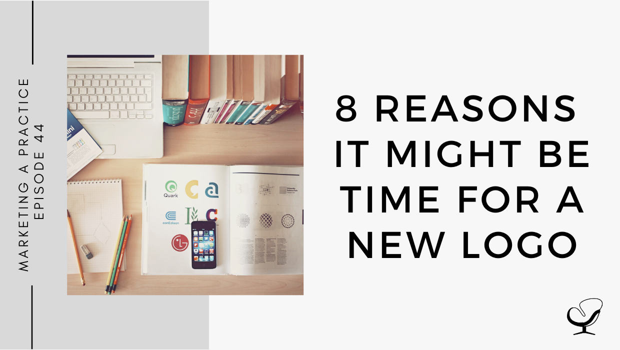
In this podcast episode, Sam Carvalho speaks about some reasons that may indicate its time for a new logo.
In This Podcast
Summary
- 8 reasons you might need a new logo
1. Your logo doesn’t adapt well to modern media
If your logo was designed for the sign on your practice’s building 15 years ago, it might not be optimized to work well on a website or on social media.
It’s important that your logo works across several mediums. In line with this, ask yourself the following questions:
- Can the logo be sized up or down and still be readable?
- Does it look good in black and white?
- Can you derive an icon from it?
- Does it make an appealing button for a mobile app?
If the answer to any of these questions is no, it may be time for a new logo design.
2. Your logo doesn’t represent your current business
Over time, most businesses evolve. It’s not uncommon for entrepreneurs to start out with one product or service, then grow and diversify into something quite different. If your logo doesn’t reflect what you currently offer, it’s time for a rebrand.
A logo isn’t about where your business was in the past. A logo should be aspirational, capturing the essence of your business today as well as where you’re headed in the future.
3. Your logo was a do-it-yourself project
If you created your logo or had a friend or family member create it, it may be time for a professional to step in.
Companies such as Apple have become very successful due in part to their emphasis on design. As a result, our world has increased its expectations of design.
If you’re not receiving compliments on your logo, it probably needs to be redesigned.
4. Your logo isn’t as appealing as your competition’s
The ability to review companies online has made the business world increasingly competitive. As such, spend some time looking at your competition’s logo designs. If their logos are more appealing than yours, that’s a good indicator that yours needs an update or a change.
If you’re not sure, compare your social media following to your competitors’. If they have more fans and followers, it may be time for a new design. Don’t underestimate the impact of good design.
5. Your logo is too complex
The growing trend in logos has been towards simplification in design. Gradients and drop shadows used to be popular in logos, but these techniques are starting to look dated. They’re also difficult to translate across mediums.
There is a preference for simple, flat designs vs realistic/3d.
6. Your logo font is hard to read
If the typeface of your logo is difficult to decipher, vague enough that it can be multiple letters or words, or just straight-up impossible to read, then it isn’t doing your logo (or your business) any services.
Get feedback on your existing logo and find out how easy it is to read. Simply because you can read it doesn’t mean that it’s easy for others.
7. Your logo colors aren’t effective
Another way of communicating messages via a logo is through color choice. There are all sorts of research and information done on the effectiveness of color psychology, especially when it comes to graphic design. Certain colors tend to trigger certain moods.
- Blue tends to be calming, soothing, and communicate trustworthiness.
- Red is enlivening, a call to action, which is why you see so many red logos in the food and drink industry.
This can lead to a juxtaposition of brand tone and personality with what the logo is presenting. For instance, if you have a massage therapy business, it’s unlikely that a fire-truck red logo will effectively communicate calm and relaxation to your potential clients.
8. Your logo looks too similar to another logo
This is a very common problem, probably because of the prevalence of certain logo trends, such as design elements, fonts, and color choices. This is especially a problem within a given market.
You should consider changing or updating your logo if there’s a good chance that it will be mistaken for another company’s logo in your area, especially if your logo is a look-alike of another brand in your market. This doesn’t always mean a complete re-brand. It could simply be a matter of making a few tweaks to the design, such as changing the color or font.
Whatever you choose, make sure that your logo makes your business stand out from the crowd. Trendy is one thing; jumping on the bandwagon and becoming indistinguishable from everyone else is quite another.
Useful Links:
- Here’s Why You NEED a Logo | MP 43
- The Meaning of Color in Branding | MP 34
- Email Sam at [email protected]
- Design Services With Sam
- Apply to work with us
Meet Sam Carvalho
 Sam Carvalho is a graphic designer living in Cape Town, South Africa, with over five years of experience in both design and marketing, with a special interest and experience in the start-up environment.
She has been working with Practice of the Practice since 2016 and has helped over 70 therapist entrepreneurs take their practices to the next level by enhancing their visual branding. She loves working with a variety of clients on design-intensive tasks and is always up for a challenge!
Follow Sam on Instagram to see some of her work. To work with Sam, head on over to www.practiceofthepractice.com/branding.
Thanks For Listening!
Feel free to leave a comment below or share this podcast on social media by clicking on one of the social media links below! Alternatively, leave a review on iTunes and subscribe!
Podcast Transcription
[SAM]:
Marketing a Practice podcast is part of the Practice of the Practice Podcast Network, a network of podcasts seeking to help you market and grow your business and yourself. To hear other podcasts like Beta Male Revolution, Empowered and Unapologetic, Imperfect Thriving, or Faith in Practice, go to practiceofthepractice.com/network.
Welcome to the Marketing a Practice podcast with me, Sam Carvalho, where you will discover everything you need to know about marketing and branding your business. To find out more about how I can help you brand your business, visit www.practiceofthepractice.com/branding. And if you’d like to see some examples of my design work, be sure to follow me on Instagram @samanthacarvalhodesign.
________________________________________
[SAM]:
Hi, there. Thanks so much for joining me today on the Marketing a Practice podcast. So today I’m following on a little bit from my previous episode, which was why a logo is important for your business. And today we’re going to be speaking about signs that you may actually need a new logo for your business. So I’ve spoken in a previous episode earlier on in my podcast about how to know when you should rebrand. And I did mention in that episode to almost take caution about rebranding because it can be a big thing to take on and it can also result in a loss of customer loyalty or a loss of customer recognition. So a rebrand is not something to take lightly. It’s something to put a lot of consideration into. But rather than speaking about an entire rebrand, today, I’m speaking about simply having a new logo. And while your logo is the basis of your branding, it is possible to kind of adjust your logo and then infiltrate whatever you’ve adjusted into the rest of your branding without necessarily having to redo your entire branding.
So for example, if you choose to simply adjust some colors in your logo, then it means that you would adjust the color scheme of your website and you would adjust the color scheme of your marketing materials moving forward to match that new color scheme. So that’s what I mean with where you can simply adjust something in your logo without necessarily having to do a complete rebrand. So, first and foremost, make sure that you put some consideration into it, that you put some thought into it, and that it’s not just something that you take on lightly.
So as covered in the previous episode, and as said by Patrick Llewellyn, who is the president and CEO of 99 Designs, a logo is your business’s public face. So you always want to make sure that you have a strong logo. And here are reasons why it might be time to redesign your logo or to adjust your logo. First and foremost, your logo doesn’t adapt well to modern media. So if you’ve been a business that’s been running for at least a decade, and your logo was designed for perhaps the sign on your practice’s building, say 15 years ago, it might not be optimized to work well on a website or on social media. Nowadays, it’s important that your logo works across several mediums. So in line with this, ask yourself the following questions. Can your logo be sized up or down and still be readable? Does it look good in black, and in white? Can you derive an icon from it? And does it make an appealing button for a mobile app? If the answer to any of these questions is no, it may be time for a new logo design. So we now live in a digital age, as you know, and if your logo was designed many years ago, in the time where perhaps print mediums were more important than digital, it may be time for a redesign or to adjust your logo to better suit the digital mediums.
So the second reason why you might need a new logo is if your logo doesn’t represent your current business. We know that over time most businesses evolve. It’s not uncommon for entrepreneurs to start out with one product or service, and then grow and diversify into something quite different. If your logo doesn’t reflect what you currently offer, it’s time for a rebrand. A logo isn’t about where your business was in the past. A logo should be aspirational, capturing the essence of your business today, as well as where you’re headed in the future. So I know that Joe Sanok from Practice of the Practice, for example, recommends or suggests going after your big ideas over and above your main business. One of those possible big ideas is to start a podcast. So if you’ve found that your practice has evolved into a podcast, obviously those are different spheres of your business. So it may not necessarily mean readjusting your main logo to incorporate your podcast because they’re different spheres. But it may mean having a variation of your logo to represent your podcast, but keeping that under one branding umbrella. And that’s sort of a different discussion that we can have on a different day, but making sure that if even your main business has evolved from, for example, a solo practice to a group practice, you want to ensure that your logo represents that transition, and that it speaks to your current business services as much as possible.
The third reason why you may need a new logo or to adjust your logo is if your logo was a do-it-yourself project. So this is something I’ve spoken to previously, where I said that a logo is definitely something where you want to invest. And even if you are strapped for cash at the beginning, when you’re starting out, you really don’t want to skimp on logo design. But if you did have to make a plan and do it yourself, or you had a friend or family member create it, it may be time for a professional to step in. Companies such as Apple, for example, have become very successful due in part to their emphasis on design. As a result, our world has increased its expectations of design. And for me, as someone who is creative, I see design wherever I look. So it’s difficult for me to kind of understand what it would be like to not have that creative eye, and to not be drawn to things from a creative standpoint. But I think just in general, that has increased, and people are going to be drawn to your brand more based on that initial impression of what it looks like and whether or not that appeals to them. So if you’re not receiving compliments on your logo, it probably needs to be redesigned.
Number four, is your logo isn’t as appealing as your competition’s. So the ability to review companies online has made the business world increasingly competitive. And now, due to most of you having to provide counseling online, I’m sure that that has been increased. So as such, spend some time looking at your competition’s logo designs. If their logos are more appealing than yours, that’s a good indicator that yours needs an update or a change. If you’re not sure, compare your social media following to your competitors. If they have more fans and followers, it may be time for a new design. Don’t underestimate the impact of good design. So if you are on Instagram, for example, and you’re struggling to gain followers, and you look at your competitors, and you see that they have quite a few followers more than you, take a look at what they’re doing. It could very well have something to do with the design of their social posts, or with the design of their logo and just their branding in general.
So, Instagram, especially, is a visual medium. And often you’re going to attract followers simply by the look and feel that you’re portraying, by the way your posts are designed. So again, don’t underestimate the impact of good design. And it could be a good way to tell whether or not the logo needs redesign. Although there are a lot of other aspects that come into how many followers a person has on social media. So I wouldn’t take that as the only benchmark, but it can help in seeing whether or not your logo needs a redo.
Another reason is that your logo could be too complex. And this is again if your logo was designed a while ago. This is a trend that has happened in logos, which is in preference towards more simple design. So things like gradients and drop shadows, which used to be popular in logos, are now starting to look outdated. They’re also difficult to translate across mediums. So remember earlier on, we spoke about how logos could have been designed more for print mediums than for digital mediums. And now it’s definitely better to have a simple logo because a lot of the time, especially if people are looking at your logo on a mobile screen, for example, it’s going to be scaled right down and you want to make sure that it’s still readable and that all aspects of it still appear clear. Whereas if you have a logo that’s too complex, a lot of the detail is going to be lost or appear blurry, and that’s not what you want. So there’s definitely a preference these days for simple logos or for flat designs versus the more olden days style of realistic or 3D logos.
So the sixth reason as to why it might be time to redesign your logo is if your logo font is hard to read. So if the typeface of the logo is difficult to decipher, vague enough that it can be multiple letters or words, or just straight up impossible to read, then it isn’t doing your logo, or your business, any services. So get feedback on your existing logo and find out whether or not it is easy to read. You obviously know what it needs to say so it can be difficult to be objective in this sense because, as I said, you know what your business is, you know what your slogan is, but find out from others what their first impression is of your logo and whether they can read everything it contains. Simply because you can read it doesn’t mean that it’s going to be easy for them. So if your logo is difficult to read, it’s definitely time to adjust the font or to have a complete redesign.
The seventh reason why it might be time for a redesign, is if your logo colors aren’t effective. So we know by now, if you’ve been listening to my podcast for a while that another way of communicating messages through a logo is through the color choice. There are all sorts of research and information done on the effectiveness of color psychology, especially when it comes to graphic design. Certain colors tend to trigger certain moods and I literally did an episode entirely about this, about color theory and about the moods and emotions that each color can have on people or can initiate in people. So definitely go and check that out if you’re stuck on colors, or if you’re looking to change the current colors of your logo.
For example, blue tends to be calming, soothing and communicate trustworthiness, while red is enlivening, a call to action, which is why you see so many red logos in the food and drink industry. This can lead to a juxtaposition of brand tone and personality with what the logo is representing. For instance, if you have a massage therapy business, it’s unlikely that a firetruck red logo will effectively communicate calm and relaxation to your potential clients. So as we discussed before, within the industry of kind of counseling and therapy, you definitely want to stick with more blue, green tones, because that kind of communicates that calming sense. Although again, as I always say, if you are wanting to stand out and be a bit more daring, you definitely can but just be very careful with the colors that you choose and look into what kind of effect they’re going to have on people who are viewing them.
So another reason or another sign why it might be time for a redesign of your logo or an adjustment of your logo is if it looks too similar to another logo. So this is actually a very common problem, and probably because of the prevalence of certain logo trends, such as design elements, fonts and color choices, you can often find that there are a number of logos that look quite similar. And so while we mentioned before about the trend towards simplification, you do want to be careful of following trends, current trends, too much. So the trend towards simplification, I would say is quite a large trend. And it’s kind of a trend that’s in keeping with the times and in keeping with the digital age as I mentioned earlier, but there are a lot of other design trends that come and go. And when it comes to a logo, which obviously you want it to be long standing and you want it to last for many years, and it’s not something that you want to be changing every year or every second year, you really want to be cautious when it comes to using design trends in your logo. You should consider changing or updating your logo if there’s a good chance that it will be mistaken for another company logo in your area, especially if your logo is a look-alike of another brand in your market. This doesn’t always mean a complete rebrand. As I said in the beginning, it could simply be a matter of making a few tweaks to the design such as changing the color, or font. So do a quick Google search or have a look on Pinterest and if you find that your logo is too similar, then it’s definitely time to change. Whatever you choose, make sure that your logo makes your business stand out from the crowd. Trendy is one thing, jumping on the bandwagon and becoming indistinguishable from everyone else is quite another.
So those are some reasons why it may be time for a new logo. If you haven’t listened to the episode before this, definitely do so; it covers why a logo is important for your business. I hope you’ve enjoyed today, and I’ll see you in the next episode.
________________________________________
[SAM]:
Thanks for listening to the Marketing a Practice podcast. If you need help with branding your business, whether it be a new logo, rebrand, or you simply want to have a print flyer designed, head on over to www.practiceofthepractice.com/branding. And if you’d like to see some examples of my design work, be sure to follow me on Instagram @samanthacarvalhodesign. Finally, please subscribe, rate, and review this podcast on iTunes if you like what you’ve heard. Talk to you soon.
This podcast is designed to provide accurate and authoritative information in regard to the subject matter covered. It is given with the understanding that neither the host, the publisher, or the guests are rendering legal, accounting, clinical, or any other professional information. If you want a professional, you should find one.