Podcast (marketing-podcast): Play in new window | Download | Embed
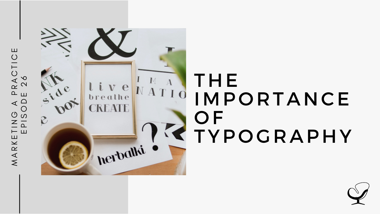
What is typography and why is it important? What are some of the important terminologies in the world of typography? Which typography tips and tricks that you can apply to your business or brand?
In this podcast episode, Sam Carvalho talks about typography and related terminology, and why typography is important to your business and to your brand.
Podcast Sponsor
Tired of never quite feeling comfortable with your practice financials? I’d like you to meet GreenOak Accounting. Their goal is to empower private practice owners with the financial information they need to make good business decisions. They specialize in working with solo and group private practices in the mental health industry, so they are uniquely positioned to help with figuring out what’s “normal” in your business finances and what’s not. So if you’ve ever had a conversation with your accountant or bookkeeper that left you wishing that they understood private practice or had some best practices to share, head over to www.greenoakaccounting.com and schedule a free consultation to see if they might be a good fit for you. They can help with all your accounting needs from bookkeeping to payroll to Profit First and budgeting & forecasting.
In This Podcast
Summary
- Defining typography
- Why typography is important for your business and for your brand
- Typography terminology
- Tips for incorporating typography into your branding
Defining typography
Typography is the art and technique of arranging type, or letters and characters. Typography includes what the type looks like and how the type is arranged, both of which are very relevant aspects in design, digital marketing, and print marketing.
Why typography is important for your business and for your brand
Typography plays a critical role in strengthening your brand, creating interest in your service, and highlighting your central message.
Good typography is important because it makes your page (website, social media account, etc.) easier to use on both desktop and mobile devices. With more people these days using their mobile phones as opposed to checking websites and social media on their desktops, it is important to check what your site looks like on mobile and make sure that all of the fonts are legible with suitable size and spacing, and that your site is easy to navigate via a mobile device. Failing to do this could lead to bad user experience.
As much as you might want to use the more decorative script fonts in your designs because they look lovely and have a more abstract look and feel, keep in mind that the type must be legible and accessible to your users, which does not include every decorative font. Typography is everywhere and in many media, from digital to print. Every font style, letter, character arrangement, and layout play a role in how the message is conveyed, so you need to pay close attention to every aspect of the typography on your sites to stay in control of the message you are trying to convey.
Typography terminology
Typeface vs font – Think of it in this way – a song is the work of art and the mp3 file is the delivery mechanism. Applying this to typography, Helvetica is the typeface while Helvetica Bold and Helvetica Light are fonts.
Each part of the letter has its own special term or label:
- Baseline – the horizontal line upon which all the letters sit
- Cap height – the distance from the baseline to the top of the capital/uppercase letter
- x-height – the height of the body of the lowercase letter, found between the baseline and the cap height.
- Bowl – the curved part of the character that encloses the circular or curved parts of some letters e.g. d, b, o.
- Descender – the longest point on the letter that falls beyond the baseline, such as the tail of a y
- Spine – the curved body of the letter s. This term is only used for the letter s because the spine can be almost vertical or almost horizontal depending on the typeface.
- Ascender – the portion of the letter that extends above the mean line of the font i.e. it is taller than the x-height. For example, in the letter h.
- Crossbar – the line that goes across the inside of the letter, connecting one side to the other. e.g. a lowercase e.
- Counter – the empty space in the middle of letters such as b.
Letter spacing is an important element to consider because differences in spacing can be very noticeable especially when enlarged, but also because letter spacing can be an effective tool to make your type stand out when used in a heading or logo. Two processes of adjusting the space between letters include:
- Kerning – the modification of the space between two letters
- Tracking – the modification of the space between each letter in a whole word.
Some other typography terminology to remember:
- Leading – the distance between baselines, or line spacing between sentences. This plays a large role in legibility in the sense that there must be enough space between the sentences/lines to make the text easily legible.
- Hierarchy – when certain words in a text stand out more than others, for example, different weights, bold/regular/light styles, italic, and size. This helps to create legible flow and indicates to the reader which are the most important points in the text. The latter is particularly important for blogs from a legibility point of view because headings, subheadings, and bolded points help to make it easier for the viewer to engage with the text and/or to scan the text and bypass the less important information and save time.
- Point size – the number assigned to a type value. Most websites use a body text set at 16 points which is a good text size as it is still legible when reduced for mobile.
Widows and orphans are words or lines that are left behind on lines or in blocks of text and should be avoided. More specifically:
- Orphan – single word or short line at the beginning of a column or page
- Widow – single word or short line at the end of a column or page
Tips for incorporating typography into your branding
1. Combine two fonts for the best effect.
Too many different typefaces on one page can be overwhelming and “visually messy”, so try to pick one font for your headings and subheadings with another font for body text. There are some tools that can help you with finding suitable fonts, such as Google Fonts, where you input font and they provide automatic pairings and font families based on those fonts. This is a great free tool to use, specifically to find a suitable font for your body text as this is how most of your information will be conveyed.
2. Choose the best font combination.
A good place to start is either to find two fonts that are very similar in form, or two fonts that are very different. Consider serif fonts and sans serif fonts.
- Serif fonts have small decorations at the end of the letters, resulting in a more classic and traditional look
- Sans serif fonts are without those decorations and look a lot cleaner and more modern.
- Using a serif font in combination with a sans serif font is quite popular and works well.
Over and above Google Fonts, you can use Canva which has a great font combination tool where they show you a matching pair based on a font that you select. Another tool is Font Pair, which lists dozens of curated combinations that are readily available for you to use in your next project.
3. Focus on readability
- Larger fonts are better when it comes to the legibility of your text.
- Always use dark fonts on light colors.
- Avoid justification, which is when all your text is adjusted to form a perfect block, creating uneven spaces that vary between words and from line to line. Visually, it creates a pleasant block but an uneven reading experience.
Useful Links:
- Blair Badenhop on Honoring Your Intuition | MP 25
- Basic Terminology You Need to Know | MP 15
- Google Fonts
- Font Pair
- Canva
- Email Sam at [email protected]
- Design Services With Sam
- Apply to work with us
Meet Sam Carvalho
 Sam Carvalho is a graphic designer living in Cape Town, South Africa, with over five years of experience in both design and marketing, with a special interest and experience in the start-up environment.
She has been working with Practice of the Practice since 2016 and has helped over 70 therapist entrepreneurs take their practices to the next level by enhancing their visual branding. She loves working with a variety of clients on design-intensive tasks and is always up for a challenge!
Follow Sam on Instagram to see some of her work. To work with Sam, head on over to www.practiceofthepractice.com/branding.
Thanks For Listening!
Feel free to leave a comment below or share this podcast on social media by clicking on one of the social media links below! Alternatively, leave a review on iTunes and subscribe!
Podcast Transcription
[SAM]:
Tired of never quite feeling comfortable with your practice financials? I’d like you to meet Green Oak Accounting. Their goal is to empower private practice owners with the financial information they need to make good business decisions. They specialize in working with solo and group private practices in the mental health industry, so they are uniquely positioned to help with figuring out what’s normal in your business finances and what’s not. So, if you’ve ever had a conversation with your accountant or bookkeeper that left you wishing that they understood private practice, who had some best practices to share, head over to greenoakaccounting.com and schedule a free consultation to see if they might be a good fit for you. They can help with your accounting needs, from bookkeeping to payroll, to profit-first and budgeting and forecasting.
Welcome to the Marketing a Practice podcast with me, Sam Carvalho, where you will discover everything you need to know about marketing and branding your business. To find out more about how I can help you brand your business, visit www.practiceofthepractice.com/branding, and if you’d like to see some examples of my design work, be sure to follow me on Instagram @samanthacarvalhodesign.
Hi there, and thanks so much for joining me today on the Marketing a Practice podcast. So, today we’re gonna be talking about typography, and we’re gonna be covering a few elements to do with typography. First and foremost, we’ll be covering the definition of typography in case you aren’t aware what it is or what it includes, or if you’ve never heard of it before. We’re then going to be covering why it’s important to your business and to your brand, and why it’s important that you know what it is and that perhaps if, up until now, you haven’t been paying attention to it, why you should start paying attention to it. We’re then going to discuss some more terminology around typography, and the reason why I’ve included this section is because it makes a difference when you communicate with your designer if you understand the terminology. And the final section that we’ll be discussing is the three best practices when it comes to typography and how you can implement this straightaway in your branding.
So, first and foremost, what is typography? Typography is the art and technique of arranging type, which includes letters and characters. So, it doesn’t only come down to what the type looks like, but how it is arranged. And this is very relevant when it comes to, even, blogging. How are you setting up your blogs? Are you including headers and sub headers and body text and things like that? It’s not only relevant to design, but it’s relevant to a lot of our digital and print marketing. So, typography plays a critical role in strengthening your brand, creating interest in your service, and highlighting your central message. By paying attention to the details of type, it can make all the difference when you’re laying out an email, eBook, or image for social media.
Good typography makes your site easier to use on both desktop and mobile devices. So, we know that there’s been a huge increase in the use of mobile devices over the last few years, and many people will actually be interacting with your website on a mobile device. So, have you taken the time to check what your typography looks like on mobile? Your fonts may be big enough and may be legible on a desktop, but perhaps they’re not legible when it comes to viewing them on a mobile device. I’m sure you’ve had times where you’ve gotten irritated with a website because the typography was illegible. Maybe it was too small, maybe it was one of those indecipherable handwriting fonts, or maybe it was spaced too closely together. Whatever the case, you left and their chance to communicate with you was gone forever. So, this is just highlighting why it’s so important to pay attention to typography and to ensure that your user experience of your website is friendly, and that your user is able to navigate through your website, that they’re able to read all the text. I know that I’m often guilty of wanting to make use of some of these lovely script fonts in my designs, and the problem, even though they look great and they include more of an abstract look and feel, they’re not always legible, and so, when it comes to including them in a logo or any other sort of important information that needs to be legible, it’s just not feasible. And so, you need to make sure that, if you are making use of sort of decorative font in your headings or in your logo, that it’s still legible.
So, another reason why it’s important to pay attention to typography is because it’s everywhere. Even if you weren’t necessarily aware of the term up until now, if you look at your phone or a billboard, your coffee cup, or even the different styles used in a blog post, you’ll see that you come into contact with typography everywhere. So, every font letter and character arrangement plays a part in determining how a message is conveyed. So, that’s ultimately what it comes down to. We want to ensure that the layout of any design of your blog post, of a social media post, of your logo, that all of it aids in conveying the message you want to convey. So, interestingly enough, one of the only college courses that Steve Jobs took was on calligraphy and typography, which he believed played a critical role in the success of Apple. He once said in a Stanford University commencement speech, “If I had never dropped in on that single course in college, the Mac would have never had multiple typefaces, or proportionally spaced fonts”. So, if Steve Jobs realized the importance of typography, then I think we need to as well.
So, you might remember, if you’ve been listening to my podcast for a while, that I did an episode on design terminology. If you haven’t listened to it yet, perhaps go back and listen to it. I basically went through some basic terminology and, again, it’s always just easier to understand some basic design terminology when working with a designer. And in that episode, I mentioned the difference between typefaces and fonts, as this is something that’s often confused. And, because it’s relevant to this episode as well, I thought I would kind of remind you of the difference, but also, I actually found a cool analogy to explain the difference. So, typographer Nick Sherman once used a great analogy to explain the differences between the terms ‘typeface’ and ‘font’. He suggested comparing these typography terms to the musical terms ‘song’ and ‘mp3’. When you’re explaining how much you enjoy a tune, you say “I love this song”. You wouldn’t say “I love this mp3”. The song is the work of art, whereas an mp3 file is just the delivery mechanism. So, when I read that, I thought that was a really awesome way to kind of remember the difference between a typeface and a font. So, a typeface will be Helvetica for example, whereas the font will be Helvetica Bold, or Helvetica Light, etc. So, that’s kind of important to understand when it comes to typography, but some other important terminology to understand is actually to do with the anatomy of a typeface. So, this is when you’re actually looking at a word, there’s a few different terminology to explain the different parts of the word, and I’ll actually have an infographic or a diagram or something included in the show notes that you can download and maybe print out to help you remember. It’s not super important stuff for you to know, but if you are currently engaged with a designer and you are trying to communicate, for example, that you want something changed in the word but you’re not sure what the term is, this may help you. So, I’m going to read through it, but it may be easier to look at it visually. But basically, each part of a letter has its own special term, similar to the bones in a human body.
So, first and foremost, we have the baseline, and this is the line where all the letters set. So, it’s the horizontal line that all the letters sit on is referred to as the baseline. You’ve then got your cap height; this is the distance from the baseline to the top of the capital letter. You’ve got your x-height, which is located between the baseline and the cap height, and it’s the height of the body of the lowercase letter. You’ve got your bowl, which is the curved part of the character that encloses the circular or curved parts of some letters, like in d, b, o. You’ve got your descender, which is the longest point on a letter that falls beyond the baseline, so that’s like the tail of a y, for example. You’ve got your spine, which is the curvy body of the letter s, and only the letter s. It gets its own term because the spine can be almost vertical or mostly horizontal depending on the typeface. You’ve got your ascender, which is a portion of the letter that extends above the mean line of a font. So, it’s taller than the font’s x-height, so you’ll often have that with your h for example. You’ve got your crossbar; this is the bar that goes across the inside of the letter and connects one side to another, like in a lowercase e, for example. You’ve got your counter, which is the empty space in the middle of letters such as b, o, or a. So, I know that that was quite a mouthful, but those are basically some terminology with regards to the anatomy of a typeface. And as I said, again, feel free to check out the image included in the show notes.
Then, some other terminology to keep in mind when it comes to typography, is kerning; this is the modification of the space between two letters, versus tracking, which is the modification to letter spacing but for the whole word. So, kerning is if, for example, I have the word ‘lavender’ and I want to adjust the spacing between the N and the D, because sometimes, and this is really more technical for a designer, but sometimes, the default spacing of the font may look a little bit off between just two letters of the word and, especially if the word is enlarged for like a logo name, for example, it can become noticeable, and so then you want to adjust just the spacing between those two letters. But if, for example, like what’s quite a nice design style at the moment is to have quite a lot of spacing between the letters of a heading, for example. I think this can look really nice, and so then you’re adjusting the tracking the space between all the letters of a word and you’re making it all the same. Leading is the distance between baselines. So, that’s basically the spacing between your sentences. And again, ensuring that there’s sufficient space between your sentences is important for legibility. Hierarchy in text is when certain words stand out more than others. So, you can use different weights, bold/regular/light styles, Italic, and sizes to create a sense of order within your text. Not only does this help create legible flow, but it helps the reader to see what the most important points are, and this is particularly important when it comes to blogs, not only for SEO purposes, it actually helps with that as well, but, from a legibility point of view, to have headings, subheadings, bolded points… all of it helps with making it easier for the viewer to engage with the text and/or to scan the text if they’re in a rush and they’re only able to engage with a certain part of the text. And we just have a few more terminology to get through, I hope you’re sticking with me.
The point size is the number you assign to a type value in design software. So, if you are doing some DIY when it comes to blogging or design and you’re not sure what size you should be making your text, it’s common to have body text set at 16 points on websites. So, that’s a good size text because remember, on mobile, the text will always be reduced. And so, even if it may look okay on a desktop, you want to make sure that it’s still gonna be legible on mobile. And again, this is something that I, at times, struggle with, because I am such a minimalist, and I love small text and a lot of whitespace, but really just making sure, even just publishing it and quickly checking on mobile to ensure that it’s still big enough on mobile and if it isn’t just increasing that size just a bit. And then the last bit of terminology is widows and orphans. These are words that are left behind on lines alone in blocks of text. So, an orphan is a single word or short line at the beginning of a column or page, and a widow is a single word or short line at the end of a column or page. And traditionally, from a printing perspective, this was definitely something that they looked out for and made sure it never happened, I think you would be aghast to find a magazine or newspaper where this occurred. It is a bit more forgivable on a digital design front, but still not great, so it’s still something that you want to avoid. So, that’s the terminology section. I know it can be a lot to take in and, if you have struggled to take it all in just by listening then, again, feel free to engage with the show notes. So, we basically covered the definition of typography, why it’s important for your business, and then some terminology around typography, also just to kind of help you understand it a bit more.
And then I just want to end off with three best practices or tips for typography that you can apply to your business. And that is, to combine two fonts for the best effect. So, once you kind of get into typography, and you start realizing all the options out there, you may get carried away with wanting to include a whole bunch, but it really is best to keep it to two. So, too many different typefaces on one page can get visually messy, so you basically want to just pick one for your headline and subheadings, and another for body text. So, there are actually a few tools that you can use to help you with this. One of them is Google Fonts. If you make use of Google Fonts, you can basically pair up with fonts. They’ll provide automatic pairings based on the fonts that you choose. So, that’s a really awesome free tool that you can use, if you’d like. So, just remember that your body text is the most important aspect when it comes to choosing a font, as the bulk of your information will be communicated here. So, pick a font that’s easy to read. Find one with a large x-height, remember we spoke about x-height? It’s basically the height of the body of the lowercase letter. So, the larger and more open the x-height of a font, the easier it is to read. So, that’s the first tip.
The second tip is, choosing the best font combination. So, how do you go about doing this? It basically comes down to combining typefaces that are either very similar in form, or very different. So, again, in the terminology episode that I mentioned earlier, I spoke about a serif font and a sans serif font. So, I’ll just recap on that as well. A serif font you’ll find where you’ve got the small decorations at the end of the letters, which result in a more classic and traditional look, whereas a sans serif font basically means without those decorations, so it’s a lot cleaner and more modern-looking. So, combining a serif font with a sans serif font is a popular combination and it usually works really well. Again, there are some tools that you can use to help you with your font combinations, over and above Google Fonts which I already mentioned. Canva actually has a great font combinations tool as well, where you can get a matching pair from a font that you select, quite similar to the Google Fonts, or you can use Font Pair. They list dozens of curated combinations which are ready to be pulled into your next project. So, I’ll include the links to all of those in the show notes if you are keen to make use of them.
And then the final tip is, to focus on readability and, we mentioned this earlier, but some things to remember when with regards to readability is that larger is better, always use dark on light colors. So, never, for example, use yellow text on a white background because it’s difficult to read rather use, you know, obviously, black-on-white is the obvious, but if you’re wanting to incorporate some of your brand colors, then just make sure it’s darker shades of your brand colors. So, if you have a green color scheme, making sure that you use a dark green on white, or a dark green on a light green, for example. And then, avoiding justification. So, those of you with OCD out there may be tempted to use justification for your text. And this is when, basically, it ensures that your text forms a perfect block. So, your sentences will always be spaced so that they reach each side of the constraint. But what happens with this is that spaces are inserted at random and they vary from line to line. And so, even though, visually, it forms a perfect block, it makes for an uneven reading experience. So, you rather wanna stick to left alignment, even though it can mean that the last sentence of a paragraph won’t necessarily stretch to the end. It definitely just makes for a smoother reading experience.
So, those three tips again are:
– to combine two fonts for the best effect; don’t use more than two. Use one for your heading and subheading, and one for your body text.
– choose the best font combination by making use of typefaces that are either very similar in form or very different, for example, a serif mixed with a sans serif, and then,
– focus on readability; remember that larger is better, always use dark-on-light, and avoid justification/make use of left alignment.
I hope you found this useful, guys. If you have any questions about typography or how you can improve on it, feel free to reach out to me at [email protected]. Otherwise, I hope that this has been useful and that you can make use of some of these tips in your future designs. See you in the next episode.
Thanks for listening to the Marketing a Practice podcast. If you need help with branding your business, whether it be a new logo, rebrand, or you simply want to have a print file designed, head on over to www.practiceofthepractice.com/branding. And if you’d like to see some examples of my design work, be sure to follow me on Instagram @samanthacarvalhodesign. Finally, please subscribe, rate, and review this podcast on iTunes if you like what you’ve heard. Talk to you soon.
This podcast is designed to provide accurate and authoritative information in regards to the subject matter covered. It is given with the understanding that neither the host, the publisher, or the guests are rendering legal, accounting, clinical, or any other professional information. If you want a professional, you should find one.